M | Academy
We
Work
We
M | Academy
Words. Pictures. Brands.
Work

Athena Logo

Athena’s logo was inspired by many things… a big bold ‘A’ for ‘Awesome’ and the promise of new beginnings. Origami that created something extraordinary from the ordinary. An arrow that pointed to financial freedom. Rays of light that illuminated a better way. The spirit of Athena — fierce yet friendly and feminine. A hand placed firmly on her heart. Modern, bold and full of human energy. Dynamic and different. Fearless with feeling.

Athena Logo

Athena Logo

We built a dynamic colour palette to ensure the logo always stands out.

Athena Logo

Athena Stationery

We created a set of stationery that was big, bold, and completely ‘Athena’.

Athena Stationery

Athena Brand Book

To help bed-in the new brand, we developed a detailed set of guidelines that captured all the rules to govern how to use the logo, tone of voice, colour, photography, illustration and typography.

Athena Brand Book

Athena's Welcome Pack

We designed the entire welcome pack for new customers to introduce them to Athena’s products and services.

Athena's Welcome Pack

Athena's Welcome Pack

Here are a couple of pages from inside the welcome pack.

Athena's Welcome Pack

Athena Bus Wrap

You don’t see many buses wrapped in chains. With thanks to The Royals, the new brand really pops in the real world.

Athena Bus Wrap

Athena T-Shirts

Athena’s logo and brand device looked so good we developed some t-shirts for the team to wear.

Athena T-Shirts

Athena T-Shirts

In fact they loved the logo so much, you rarely see the Athena team wearing anything else!

Athena T-Shirts

Colours that pop!

The new brand made a splash in out-of-home advertising.

Colours that pop!

Athena Web Site

To help build awareness of the impending launch, the amazing team at Story 1st Technology 2nd created this cool site.

Athena Web Site

Athena in your pocket

The dynamic lines and colours worked perfectly on Athena’s site (designed by Athena’s internal design team).

Athena in your pocket

Athena's Site

Here’s a view of the desktop version of Athena’s web site (designed by Athena’s internal design team).

Athena's Site

Athena Digital Small Ad

The brand really came to life when we animated it throughout our digital channels.

Athena Digital Small Ad

Athena LinkedIn

Even in small spaces, the angles and colours create great drama.

Athena LinkedIn

Athena Digital Tower

Here’s another example of how the brand works in digital channels.

Athena Digital Tower

A new logo

Much like Artificial Intelligence, the name ‘Alpha Indigo’ revealed a natural tension that exists between the masculine, the feminine, the manufactured, and the human. Creatively, this provided an excitingly evocative platform to combine two diametrically opposed ideas and create a single unified concept. Using this as our creative direction, we created a three-toned angular ‘A’ that was slightly discordant, yet full of a dynamic energy.

A new logo

An electric colour scheme

Again, we took inspiration from the duelling binarisms of Alpha Indigo’s DNA to create a bright and electric colour palette.

An electric colour scheme

Colours

They say opposites attract, and our big, bright colours are no different. We have three hero colours that we use in our logo —pink, blue and indigo. Bland, they ain’t. We particarly like using them in combination to create a singularly striking look.

Colours

A new push-pull visual language

We built the entire brand on the back of the seemingly contradictory ‘binarisms’ that make up artificial intelligence. These two ‘forces’ informed everything we did, from the logo shapes, colours and choice of typeface. Once complete, we packaged everything up into brand book.

A new push-pull visual language

Alpha Indigo Brand Book

Here are a couple of pages from Alpha Indigo’s Brand Book.

Alpha Indigo Brand Book

A visual language built for the future

We combined opposing colours in our photography to create a bold new look.

A visual language built for the future

A new identity for Crunchwork

We created a new brand identity for Cruncwork — Codafication’s new hard-working virtual office manager.

A new identity for Crunchwork

Comprehensive style guide

We created a comprehensive set of style guides to help Codafications internal marketing team and creative partners work with the new brand.

Comprehensive style guide

Style Guide

Not only were the guidelines informative, they visually demonstrated how the brand should look in the real world.

Style Guide

T-Shirts

We created t-shirt designs and stationery designs to show off the new brand.

T-Shirts

Web Site

The new brand was designed with the web in mind.

Web Site

Home page

The bright colour scheme helped bed-in the easy-going nature of the brand.

Home page

New Stationery

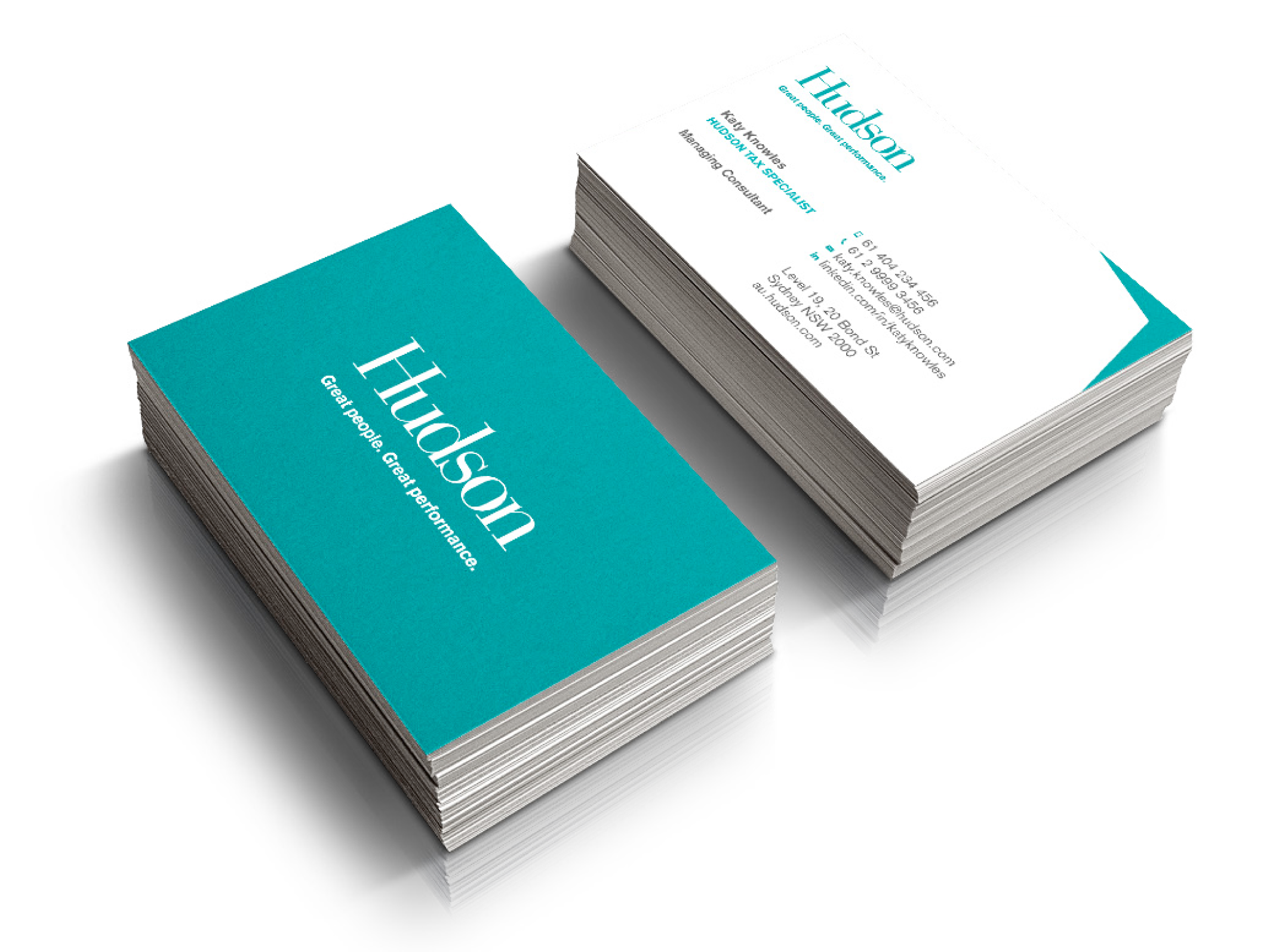
We created new stationery designs including these business cards.

New Stationery

Getting behind the new brand

The team in Brisbane really embraced the new brand.

Getting behind the new brand

A smart new logo for Cover Genius

We created a new suite of logos using the same brightly-coloured building blocks to spell out each brand. Within the Cover Genius logo, the ‘C’ ‘protects’ the ‘G’, while a sense of spirit, innovation and energy is captured in the forward-focused chevrons that always point upwards in recognition of their restless desire to deliver the smartest solutions for their customers.

A smart new logo for Cover Genius

Logo Identities

We created a brand new suite of logos for the Cover Genius, XCover and Rental Cover brands. Using the same brightly-coloured building blocks gave everything we did a strong sense of consistency — binding the entire visual language together.

Logo Identities

A strong composition

Whenever we produce new logos, we first test them to see how they work across a multitude of backgrounds. The design, shape and composition always comes before colour.

A strong composition

XCover Logo

To ensure each of Cover Genius’ brands looked consistent, we used the same graphic shapes to construct each logo.

XCover Logo

Rental Cover Logo

Along with using the same shapes to make up each logo, the initials of each brand are represented within the design.

Rental Cover Logo

Yellow, a fresh new brand colour

As a nod to Cover Genius’ previous brand colour, we stripped out all the magenta to create a fresh new palette.

Yellow, a fresh new brand colour

A logo that works for small and big spaces

New signage was created for Cover Genius.

A logo that works for small and big spaces

T-Shirts

To help build excitement internally, we included new t-shirts in staff induction packs.

T-Shirts

Out of home advertising

We created a series of draft ads to be used in out of home advertising.

Out of home advertising

A new Illustration style

The colours looked great in the new colour palette.

A new Illustration style

A fresh new look

No matter the medium, the new brand looked great.

A fresh new look

Brand Guidelines

We wrote a detailed, yet easy-to-follow document that detailed all the rules on how to use the Cover Genius brand.

Brand Guidelines

Cover Genius Web Site

The angled lines, and fresh new colour palette worked perfectly in digital channels.

Cover Genius Web Site

XCover Web Site

The XCover web site. Built by the excellent internal design team at Cover Genius.

XCover Web Site

Mobile site

The mobile site is fresh and clean.

Mobile site

A new way forward for Hudson

We helped Hudson rethink their positioning by developing a new tagline which we displayed under their logo. We also used the tagline as an inspirational guide that defined our approach to the entire re-branding project.

A new way forward for Hudson

Refreshed stationery

We developed a whole new visual language for Hudson which meant re-designing everything from billboards to business cards.

Refreshed stationery

Making the logo stand out

We created a brand device to sit behind the logo. Not only did this provide a strong and uniquely identifiable shape, it also created a consistent look throughout all of Hudson’s communications.

Making the logo stand out

Infographics

The hexagon ‘brand device’ really came into it’s own when we used it in illustrations and infographics.

Infographics

Illustrations

We developed an isometric illustration style that was clean, simple, and modern. It also ensured that everything we did was instantly recognisable as Hudson.

Illustrations

Redesigning Hudson's brochures

The hexagonal-shaped brand device allowed us to lay out complex information in an interesting and highly-branded way.

Redesigning Hudson's brochures

Photography

To emphasise Hudson’s commitment to empowering people, we developed a super-close-up photographic style that made them stand out from everyone else.

Photography

Photographic libraries

We also built a photographic library for all the international marketing teams to tap into — ensuring every future piece of collateral was on-brand.

Photographic libraries

Hudson Reports

Hudson produced hundreds of reports every day, so we created detailed templates for them to use.

Hudson Reports
Hudson_Preso_01.png

Hudson Presentation Templates

Like most businesses, Hudson produced hundreds of presentations every day, so we created detailed templates to fit every need.

Hudson Presentation Templates

Hudson Web Site

Taking a digital-first approach, we created detailed working prototypes to demonstrate how the new brand would work in online environments.

Hudson Web Site

Hudson eNewsletter

We also created a series of newsletter prototypes that could be used throughout the business.

Hudson eNewsletter

Hudson Branded Email

Here’s a template we created for all Hudson’s branded emails.

Hudson Branded Email

Redesigning Hudson's Job Search Site

Another of the key outcomes from the project was the complete redesign of Hudson’s job search site.

Redesigning Hudson's Job Search Site

Signage

Being a global business, we set about creating new signs for each of their 23 country offices.

Signage

Banners

Again the brand device was a great way to house the Hudson logo, while also directing the viewer’s eye to all the important information.

Banners

Hudson Brand Guidelines

Lastly we packaged everything up into a comprehensive brand book that covered everything you needed to know about the Hudson brand.

Hudson Brand Guidelines

Hudson Brand Guidelines

Here are a couple of sample pages from the Hudson brand guidelines.

Hudson Brand Guidelines

Hudson Mobile

One of the key outcomes from the project was a comprehensive re-design of Hudson’s global web site.

Hudson Mobile

Hudson Web Site

One of the key outcomes from the project was a comprehensive re-design of Hudson’s global web site.

Hudson Web Site
TASK_Signage_01.png
Task-window_02.png
TASK_web_01.png
Sokkah_07.png
Bresciano_Still_Standing_09.jpg
Brosque_Capitan_26.jpg
Cahill_Overhead_06.jpg
Cahill_Super_Timmy_27.jpg
Cahill_Super_Timmy_29.jpg
Cahill_Super_Timmy_Logo_07.jpg
Cahill_Super_Timmy_Logo_34.jpg
Cahill_Super_Timmy_Running_31.jpg
Jedinak_Supreme_Leader_14.jpg
Jedinak_Supreme_Leader_21.jpg
Kerr_FECT_Comic_04.jpg
Kerr_Kerr-POW_Comic_23.jpg
Kerr_Kerr-POW_Comic_29.jpg
Kerr_Kerr-POW_Comic_33.jpg
Kickaburra_06.jpg
Logarzo_Chloe_17.jpg
Luongo_Mass_Attack_02.png
Maradona_Warhol_04.jpg
Matildas_Established_1979_10.jpg
Matildas_Names_Black_25.jpg
Matildas_Pop_18.png
Matildas_Since_1979_Black_01.jpg
Matildas_Since_1979_Black_03.jpg
Mooy_Mooyakovski_13.jpg
Mooy_Pastey_Pirlo_05.jpg
Rapinoe_Who_Runs_The_World_10.jpg
Rogic_Stripes_15.jpg
Ryan_Saving_Private_Ryan_23.jpg
Socceroos_Retro_Socceroos_Kangaroo_05.jpg
Socceroos_Retro_Socceroos_Kangaroo_13.jpg
Sokkah_Eat_Sleep_Repeat_10.jpg
Viduka_Paint_09.jpg
AI_logo_ver_B&W_k copy.png
ALDI_logo_k_simple copy.png
Arena_logo_RGB.png
Athena_logo_B&W_vert_k copy.png
CO_logo_VER_k.png
CG_logo_B&W_k_vert copy.png
CP_logo_k copy.png
Crunchwork.png
CE_Masthead copy.png
HB_logo_11 copy.png
Fireglow_logo_grey.png
Foxtel_logo_RBG.png

Greenr

Greenr
Hudson_logo_k copy.png
TLC_logo_vert.png
NAP_Logo_Type_k copy.png
Orange_logo_grey.png

Otivo

Otivo
SS_logo_grey.png
SA_logo_grey.png
ST_logo_grey.png
SFC_logo_mono_pos copy.png
T2T_logo_k copy.png
TASK_k copy.png
TE_logo_k.png

Tomorrows

Tomorrows
UNSW_logo_k copy.png

Urban Grow

Urban Grow
XCover_logo_grey.png

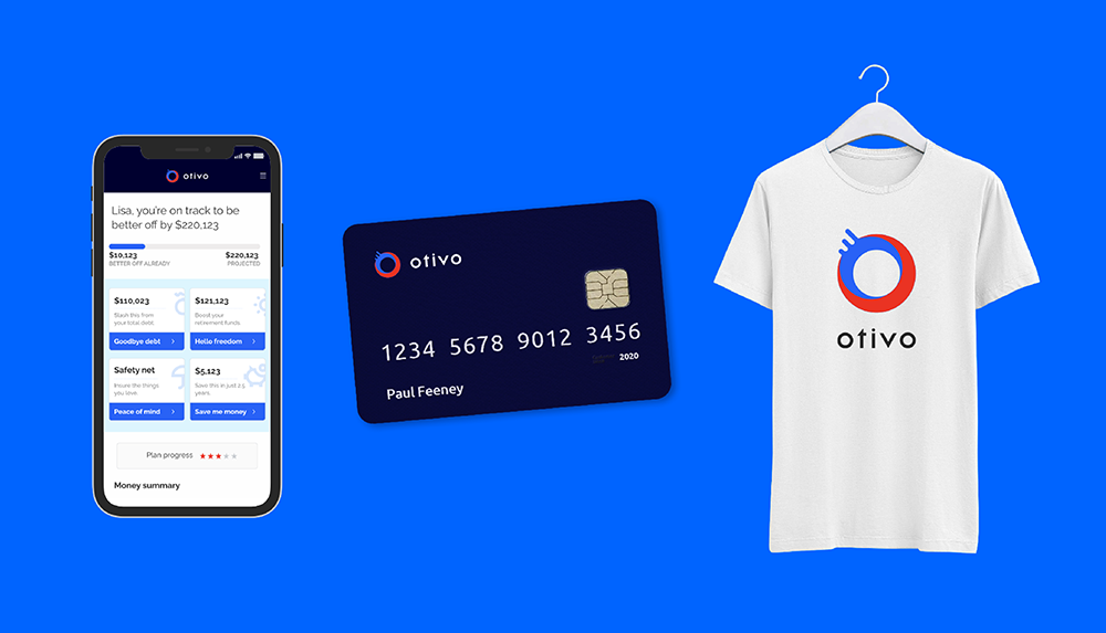
A new name and brand identity

Inspired by the Latin words for ‘choose’ and ‘life’ we helped the team discover a new brand name, and then created a slick new brand identity.

A new name and brand identity

Mobile-ready interfaces

We designed a brand new mobile-ready interface.

Mobile-ready interfaces

A new visual language

We combined two strong and dynamic colours with a limited accompanying palette to strengthen to create a unique and easily recognisable visual language.

A new visual language

A brand that works across all media

We wrote and designed a suite of brochures and advertising collateral to help spread the word about Otivo.

A brand that works across all media

Bags of fun

Finance boring? Not at Otivo. Instead, we created a unique and professional visual language.

Bags of fun

A visual language optimised for digital

By using a limited palette and a fresh new tone, we created an experience that feels personal and welcoming.

A visual language optimised for digital

Making Financial Advice accessible

We wrote and designed a new product interface and website making financial advice easy.

Making Financial Advice accessible

A consistent brand

No matter the medium, Otivo’s visual language was consistent.

A consistent brand

Iconic icons

We hand-drew every pixel of every icon to help make Otivo feel absolutely unique.

Iconic icons

Creating a brand that projected professionalism

Instead of relying on stock imagery, Otivo took the brave step to create a new bespoke visual language that required us to hand draw hundreds of icons, illustrations and infographics.

Creating a brand that projected professionalism
Athena
Alpha Indigo
Codafication
Cover Genius
Hudson
TASK
Strip Tees
Clients
Otivo
 

Recent projects | About us | Why choose us | Our founder | Our digital strategist | Testimonials | Contact

 
M | Academy
+61 430 507 068 rob@macademy.com
Hours
Mon 9am to 6pm
Tue 9am to 6pm
Wed 9am to 6pm
Thu 9am to 6pm
Fri 9am to 6pm
Sat Closed
Sun Closed

© M | Academy PTY LTD  | ACN 667847967